

Creating Bar Charts using Python Matplotlib
Bar charts are a popular type of graph used to visualize categorical data. They are simple yet powerful tools for data exploration and communication.
In this blog post, we will explore how to create bar charts using Python Matplotlib.
Python Bar Plots
Matplotlib is the most usual package for creating graphs using python language. Here, in this tutorial we will see a few examples of python bar plots using matplotlib package.
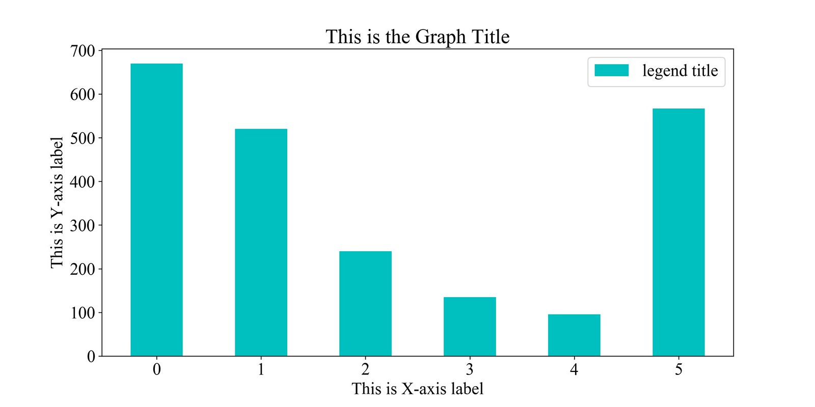
A simple bar plot
from matplotlib import pyplot as plt
from matplotlib.pyplot import figure
import numpy as np

# Defines the chart font style
font = {'family' : 'Times New Roman',
        'weight' : 'bold',
        'size'   : 18}

# includes the chart font style
plt.rc('font', **font)

# You can also define like this
# plt.rcParams["font.family"] = "Times New Roman"

# To define figure size
figure(num=None, figsize=(12, 6))

# Defines X-axis labels and Y-axis values
x_axis_labels = ['0', '1', '2', '3', '4', '5']
y_axis_values = [670, 520, 240, 135, 96, 567]

# Creating n-dimensional array with evenly spaced values
y_pos=np.arange(len(x_axis_labels))

# Input bar values
# Define the bar styles with width, color, and legend labels
plt.bar(y_pos + 0, y_axis_values, width=0.5, color = 'c', label='legend title')

# Define X-axis labels
plt.xticks(y_pos, x_axis_labels)

# Defines best position of the legend in the figure
plt.legend(loc='best')

# Defines X and Y axis labels
plt.ylabel('This is Y-axis label')
plt.xlabel('This is X-axis label')

# Defines plot title
plt.title("This is the Graph Title")

# Show the plot
plt.show()

# To save the figure as pdf/png/jpg, use plt.savefig
# plt.savefig('Figure_name.pdf', dpi=300)
The output will look like the following-
Other modifications
If the xLabels are word strings and you want to place those vertically, modify the plt.xticks as follows:
plt.xticks(y_pos, x_axis_labels, rotation='vertical')
To create the bar horizontally, use plt.barh instead of plt.bar. N.B.- the width may not work always in plt.barh option. So, it will look like as follows:
plt.barh(y_pos + 0, y_axis_values, color = 'c', label='legend title')
To find more about bar/barh options go to the official documentation. matplotlib.pyplot.bar official documentation
Update: rotation=’vertical’ does not work always right. It is better to exchange the X/Y-axis values. See the following thread in StackOverflow:
Vertical Bar chart using rotation=’vertical’ not working
Subplotting two bars side by side (with log scale)
Here in the following code, we show plotting two plots together as subplots. Also, if there is big differences between values, we can use logarithmic values instead of plotting plain values.
Subplots
import numpy as np
import matplotlib.pyplot as plt
from matplotlib.pyplot import figure
import math
figure(num=None, figsize=(16, 6))
font = {'family' : 'Times New Roman',
        'weight' : 'bold',
        'size'   : 15}

plt.rc('font', **font)

# Defines values for the first plot
x1 = ['0', '1', '2', '3', '4', '5']
y1 = [7260, 17, 194, 119, 563, 55]

# Defines values for the second plot
x2 = ['0', '1', '2', '3', '4']
y2 = [758, 45, 1098, 913, 46]

# Draw first subplot using plt.subplot
plt.subplot(1, 2, 1)
plt.bar(x1,y1, color='navy')
plt.yscale('log')            # Defines log scale
plt.xlabel('First X-Axis')
plt.ylabel('Number in log10 scale')

# Draw second subplot using plt.subplot
plt.subplot(1, 2, 2)
plt.bar(x2,y2, color = 'navy')
plt.yscale('log')            # Defines log scale
plt.xlabel('First Y-Axis')
plt.ylabel('Number of posts in log10 scale')

plt.show()
# plt.savefig('subplots with log scale.pdf', dpi=300)
The output will look like the following-

Group Bar Plots
Group bar plot with four members
from matplotlib import pyplot as plt
from matplotlib.pyplot import figure
import numpy as np
font = {'family' : 'Times New Roman',
        'weight' : 'bold',
        'size'   : 18}

plt.rc('font', **font)

figure(num=None, figsize=(14, 7))

t_1 = [854, 1185, 1860, 377, 352]
t_2 = [258005, 385351, 800054, 194111, 99980]
t_3 = [26794, 39706, 78924, 18066, 8666]
t_4 = [1491, 2032, 4358, 765, 469]


Labels=['test-1', 'test-2', 'test-3',  'test-4', 'test-5']
y_pos=np.arange(len(Labels))
plt.bar(y_pos + 0, t_1,width=0.2, color = 'navy' , label='test label-1')
plt.bar(y_pos + 0.2,t_2, width=0.2,color = 'skyblue',label = 'test label-2')
plt.bar(y_pos + 0.4, t_3,width=0.2, color = 'darkcyan' , label='test label-3')
plt.bar(y_pos + 0.6, t_4,width=0.2, color = 'black' , label='test label-4')

plt.xticks(y_pos, Labels)
plt.yscale('log')
plt.legend(('test label-1','test label-2', 'test label-3', 'test label-4'))
plt.ylabel('Number in log10 scale')
plt.xlabel('Different X-Axis labels')
plt.title("Put a title here")
plt.show()
# plt.savefig('figure_name.pdf', dpi=300)
The output will look like the following-

Create bar chart from file
If we want to plot values from csv file, we can use pandas read_csv function.
import pandas as pd
import numpy as np
import matplotlib.pyplot as plt
from matplotlib.pyplot import figure

font = {'family' : 'Times New Roman',
        'weight' : 'bold',
        'size'   : 18}

plt.rc('font', **font)
figure(num=None, figsize=(12, 6))

# Read CSV file
data = pd.read_csv("market_value.csv", sep='\s*,\s*',
                           header=0, encoding='ascii', engine='python')

# prints the column names
# print(table.columns.tolist())

# Create the bar plot for 8 rows in CSV file
plt.bar(x=np.arange(1,9), height = data['Market Value'])

# Set Plot Title
plt.title("Market Value of Tech Companies in 2019")

# Set X-Axis values for 8 rows in CSV file
plt.xticks(np.arange(1,9), data['Companies'], rotation=60)

# Set X/Y-Axis labels
plt.xlabel("Tech Giants")
plt.ylabel("Market value in Billion")

# Show Plots
plt.show()

# Save Figure
# plt.savefig('market analysis using python matplotlib.png', dpi=300)
The output should look like following:

Promotions and Referrals (US Residents Only)
- Chime: Open a Checking account at Chime using my referral link and get $100 after your employer deposit paycheck of minimum $200 within the first 45 days.
- Rakuten: Get $30 after you spend $30 at Rakuten select stores after you use my referral link to open an account.
-
Chase Freedom Credit Card: Earn $200 cash back with Chase Freedom Unlimited or Chase Freedom Flex credit card. I can be rewarded if you apply using my referral link and are approved for the card.
- Chase Checking Account: Get $200 when you open a checking account using my referral link after your first salary is deposited.
- Discover: Earn $50 cash back with Discover when you apply using my referral link and are approved for the card.
- Amex Blue Cash Preferred: Earn $250 as statement credit when you spend $3000 in first six months. Apply using my referral link.

Leave a comment